
info@shopespot.com
Choosing the right responsive website template is one of the most important decisions when building a modern website. A good template doesn’t just look nice it ensures your site works properly on mobile phones, tablets, laptops, and desktop screens.
If you choose the wrong template, you may end up with slow loading pages, poor mobile usability, or a website that needs constant fixes. This guide explains how to choose responsive website templates that are flexible, user-friendly, and built for real-world use.
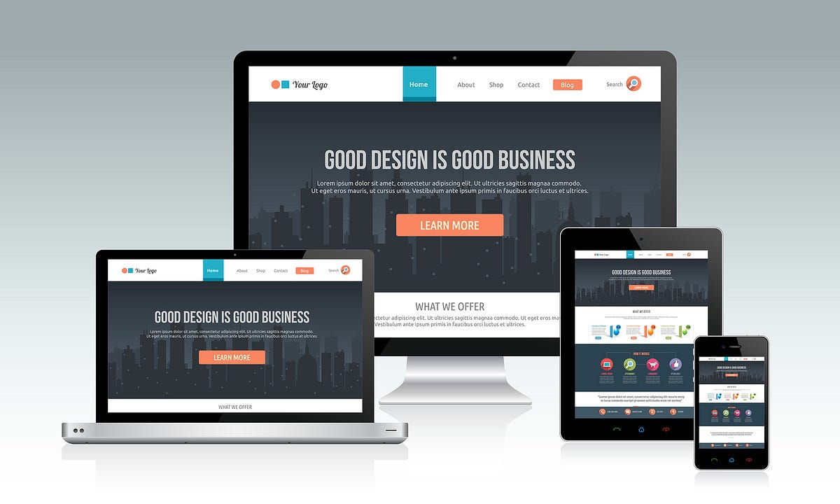
A responsive website template is a pre-designed website layout that automatically adjusts to different screen sizes. Instead of creating separate versions for mobile and desktop, one responsive template adapts its layout, images, and text automatically.
This makes responsive templates ideal for:
Business websites
Ecommerce stores
Service-based websites
Landing pages and portfolios
A single responsive template saves time, reduces maintenance, and delivers a consistent experience across all devices.
Not all responsive templates are built the same. Some only look good on desktop, while others struggle on mobile screens.
Choosing the right responsive website template helps you:
Improve mobile usability
Reduce bounce rates
Load pages faster
Maintain consistent branding
Support better SEO performance
A well-chosen template becomes a long-term foundation for your website.
When choosing a responsive website template, always check how it looks on mobile first.
A strong mobile-first template should:
Display content clearly on small screens
Use readable font sizes
Have touch-friendly buttons and menus
Avoid cluttered layouts
If a template works well on mobile, it usually scales smoothly to larger screens.
A good responsive template should be flexible, not rigid.
Look for templates that allow you to:
Rearrange sections easily
Add or remove content blocks
Adjust spacing and alignment
Scale content without breaking the layout
Flexible templates make it easier to grow your website over time.
Explore responsive website templates designed for flexibility and real-world use
Different websites need different layouts. When choosing a responsive template, think about what you’re building.
For example:
Ecommerce websites need clear product layouts
Business websites need structured sections
Service websites need strong call-to-action areas
Choosing a template built for your website type saves time and avoids unnecessary customisation later.
The best responsive website templates are easy to customise, even if you don’t have design or technical skills.
A good template should support:
Drag-and-drop editing
Easy text and image updates
Brand colour and font changes
Simple layout adjustments
This allows you to control your website without relying on developers.
Responsive templates should not slow your website down.
When choosing a template, make sure it:
Loads quickly on mobile networks
Uses optimised images
Avoids unnecessary animations
Feels smooth when navigating
Fast-loading templates improve both user experience and search engine rankings.
Instead of building layouts from scratch, it’s easier to use professionally designed templates that are already optimised for responsiveness.
Browse responsive website templates available on Shopespot
These templates are designed to work across all devices and can be customised for different industries.
To use responsive website templates on Shopespot, you’ll need an account. Once signed up, you can select a template, customise it, and publish your website.
Create an account to access templates and start building your website right away
This gives you access to tools that let you design, edit, and manage your website from one platform.
Avoid these common mistakes:
Choosing a template based on desktop design only
Ignoring mobile layout quality
Picking overly complex designs
Using templates that are hard to customise
Not testing responsiveness before publishing
A simple, well-structured template often performs better than a flashy one.
Choosing the right responsive website template doesn’t have to be complicated. Focus on mobile usability, flexibility, performance, and ease of customisation.
When you start with a strong template, everything else becomes easier from content creation to long-term growth.
View responsive website templates
Create your Shopespot account and start building